For three sunny days I spent my time in downtown Brisbane attending The Design Conference 2019 (TDC). Keeping my creative finger on the pulse, events like these are the perfect place to see who is making waves in our industry and hearing from some pretty grouse creatives.
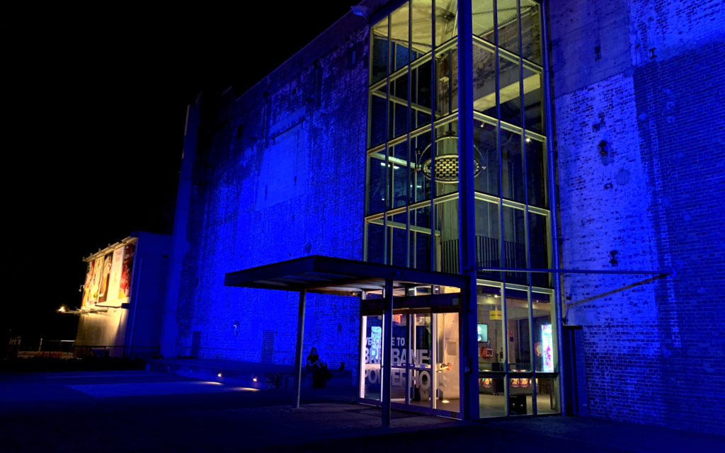
This year’s event, at the beautiful Brisbane Powerhouse, focused on how we, as creatives, can make our industry better. From mental health, to job satisfaction, to user experience, to gender diversity. Many of the speakers were walking talking examples of the efforts being made and others spoke about how we have the powerful tools to make it all change.
Female’s now proudly make up 10% of Creative Director roles (go Lisa!) within the industry, although interestingly, the TDC audience was more than 50% female.
I went into day one with a bundle of excitement (mostly for the occasional bit of sun shine) for the loads of inspiration I’d be receiving by the second. I was looking to walk away with an abundance of graphics ideas, but what I ended up receiving was strategic and process inspiration. How to attain more useful working briefs, do better research and create valued brand experiences. The best example of this didn’t even come from a designer.
Amanda Munilla is the Managing Director of Wolff Olins, a brand consultancy firm in San Francisco. Amanda took us through their rebrand of Uber, why they did what they did and how they made the brand internationally accessible. The basis for everything they did was research and loads of it. They circled the world (twice) visiting head offices, talking to workers; they used the service in different countries, speaking to drivers; and their team of developers, designers and strategists worked out what was and wasn’t working for the brand at a crucial point in time for their worldwide image.
What they created was a seemingly plain brand that had powerful vision for the future, plus instant recognition around the world. They answered questions around passenger safety by improving the brand’s visibility in cars (more clearly marked). To ensure accurate replication of the brand, they chose to stay with a black and white colour palate. To improve language accessibility, they took symbols and colours that everyone already knew and integrated them into their apps (warnings, cars, bikes etc.). The result was a functional and value packed experience for everyone, from the inhouse design team, to the next person to catch a ride.
Apart from some new-found software skills, the biggest takeaway from the 3 day event was
that pretty graphics aren’t purely what we were trained to create. Yes, they are a huge by-product of our output, but our actual job is to build brands or platforms that have reason, meaning and value behind them, the meaning is what will make them great.
Design has the power to improve communication and it’s my responsibility to use my skills to do so.
Bring on next year!
If you want to receive monthly emails from the Evolution team with our latest blog post, hot off the press, please sign up here.
